Before making our final magazine cover, it was important that I flat planned the magazine cover to give me an idea for what we wanted. I was inspired by Empire and Film magazine.
(Click to enlarge)
When we were deciding on what to call our magazine, we came up with 'terror' as we felt that it suited the horror genre, unfortunately, we didn't like the title in the end because we felt that it would not appeal much to our target audience and would attract audiences younger than 15.

Secondly, we decided to name our magazine 'Cinema'. We felt that it suited the magazine more because as we researched into different magazines, we never found any magazine title that was aimed at one specific genre.
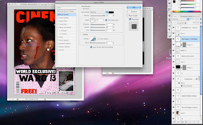
This magazine is purely dedicated to movies and films only and we felt that it was suitable name for a magazine with no specific genre. I used adobe photo shop to edit the magazine.

With the magazine that I researched into, I found that most film magazines usually had 1 character on the front which is why I had chosen to use 1 character on my front page and It also draws the attention to the main character only.

Secondly, I used the lasso tool to cut her out only in order to place her on top of the magazine name. I had chosen to do to this, as I felt that it showed to respect to the character.
From the previous magazine that I created in yr 12, I made sure to include all the necessary elements within a magazine such as price, date, issue, title and other information to lure people in.

This is the final magazine cover: (Click on to enlarge)


No comments:
Post a Comment